About the makeover
Makeover Monday is a weekly learning and development challenge. Each week, there is a data set/visualization released, and you are tasked with creating a better, more effective visualization to help make information more accessible. It is a fantastic way to:
- Become a better data storyteller
- Improve your skills in Tableau, PowerBI, etc.
- Stay in the analytical mindset with new data sets
- Develop a better sense of information architecture
- Try out new techniques you normally would not try
- and experiment with new layouts and other approaches
I decided to take on some #MakeoverMonday challenges this year in between projects at work, under the spirit of R&D (Research and Development). The techniques and tricks I develop in R&D can then be applied to the projects I work on in my career.
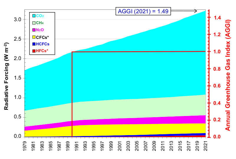
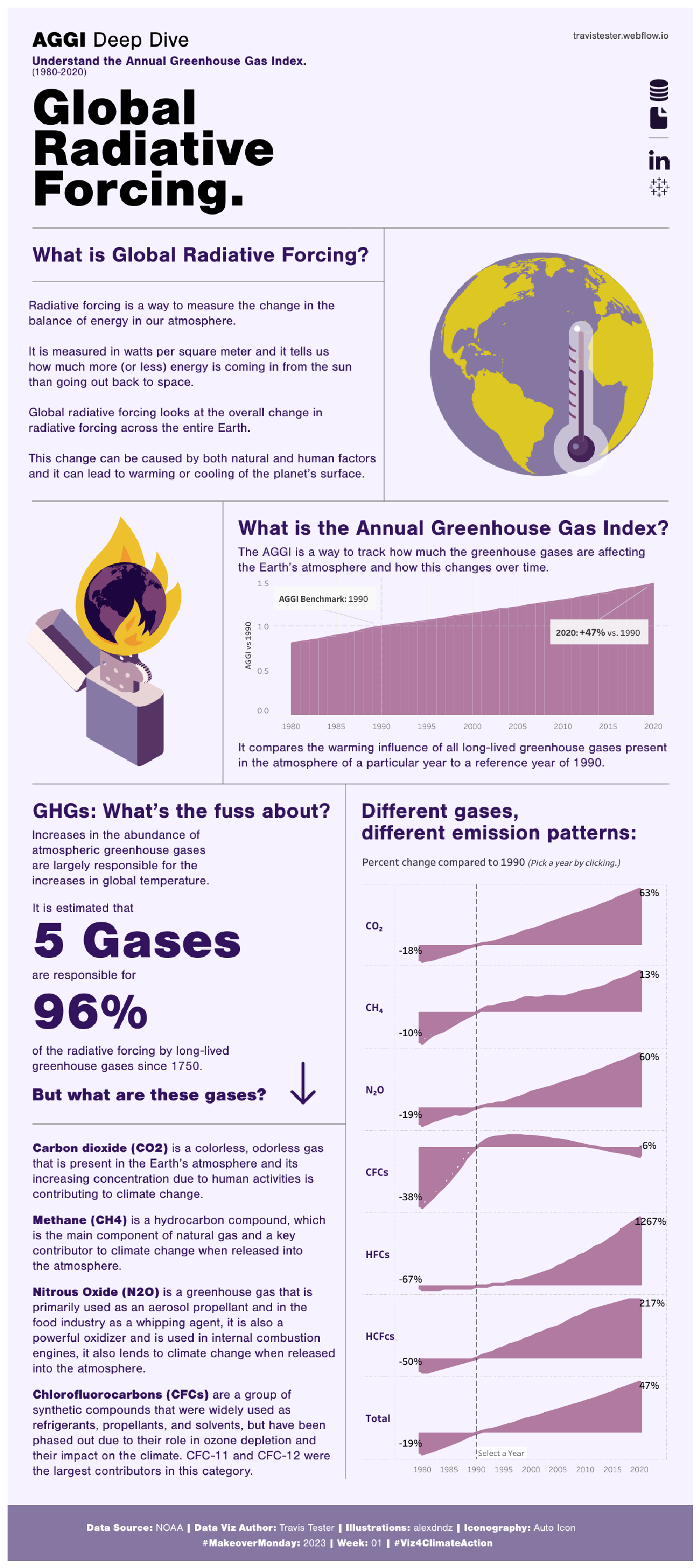
The first #MakeoverMonday prompt for 2023 introduced a data set over the environment and biodiversity in the form of Global Radiative Forcing. Below, you will find my makeover, the original chart, and what I learned.
To view the interactive version, visit the Live preview link above, or my Tableau portfolio here.
Makeover results
I learned quite a lot of new things this project, mainly:
- How to pass variables in Tableau by using Parameters
- How to use images to create buttons that link to websites.
- How to annotate a data visualization for better storytelling.